Background
As of ggplot2 0.9.0 released in March 2012, there is a new generic function autoplot. This uses R’s S3 methods (which is essentially oop for babies) to let you have some simple overloading of functions. I’m not going to get deep into oop, because honestly we don’t need to.
The idea is very simple. If I say “I’m sending a letter to my sister”, you wouldn’t be all, “Oh, which letter? I’m fond of ‘A’ myself.” Or if you would, you’re an idiot. We understand that in common language, there are some words with multiple applications. A letter can be something like ‘A’, but it can also be a message you send to someone (really, a collection of letters with special meaning). Your brain supplies the correct meaning to you through context. Likewise, we might talk about a product of real numbers or a product of matrices. These are mechanically different things, but with the same kinds of general properties, and so each gets called ‘product’.
The R interpreter can do the exact same thing. And frankly, you’ve probably been using this already, though maybe without even knowing it. If I construct a linear model in R
mymodel <- lm(y~x)
Then you should well know by now that certain things like “plot(mymodel)” (by the way, I loathe naming things “my” anything, but it is useful pedagogically) have special meaning. You don’t have to tell R that “oh by the way, that’s a linear model, so I want you to produce some diagnostic plots for me, they should look like …”. R understands exactly what you want to look at in this context. For a concrete example, try this one on for size:
n <- 50
y <- rnorm(n)
x <- matrix(rnorm(n*4), ncol=4)
mymodel <- lm(y~x)

class(x)
class(mymodel)

summary(x)
summary(mymodel)
Notice how the class (type of thing) of x and mymodel differ, and so does the type of output from summary() applied to these objects.
Autoplot
So how do we use autoplot? Basically, you have a thing of class “myclass” (ugh) that you want to define a plotting method for. Meaning, your class has a rigidly defined structure and you want to be able to produce the same kind of plot on any one of those objects. Basically, all you have to do is:
autoplot.myclass <- function(x, ...){
# ggplot code here
}
After you define this function, invoking autoplot(x) on an object x with class myclass will produce the plot you want. Yayyyy. Really, that’s all there is to it.
Example: Autoplot and Time Series
For example, say you routinely work with time series, but you want that weird grey background from ggplot in your timeplots. Not a problem. All you need to do is something like:
library(ggplot2)

# Timeplotting a ts object
autoplot.ts <- function(x, ..., xlab="", ylab="", title=""){
  time <- attr(x, "tsp")
  time <- seq(time[1], time[2], by=1/time[3])
  df <- data.frame(x=x, time=time)

  ggplot(data=df, aes(time, x)) +
    geom_line() +
    scale_x_continuous(xlab) +
    scale_y_continuous(ylab) +
    opts(title=title)
}
To test this out, you can use the Mcomp package which has over 1000 different time series to play with:
x <- M1[[222]]
class(x$x)
autoplot(x$x)

x <- M1[[893]]
autoplot(x$x)
Notice that when defining an autoplot template, we use autoplot.myclass, but when invoking it, we merely need to request autoplot(x). Additionally, notice that we had to do the unsightly x$x business. That’s because when we created x, we were creating an object of class Mdata, while x$x is of class ts. If we want to be able to plot Mdata objects as in the way plot() can, this doesn’t require much additional thought:
library(ggplot2)

# Timeplotting an Mdata object
autoplot.Mdata <- function(x, ..., xlab="", ylab="", title=x$sn){
  time <- attr(x$x, "tsp")
  time <- seq(time[1], attr(x$xx, "tsp")[2], by=1/time[3])
  df <- data.frame(x=c(x$x, x$xx),
    time=time,
    xx=c(rep(NA, length(x$x)), x$xx)
  )

  ggplot(data=df, aes(time, x)) +
    geom_line() +
    geom_line(data=df[!is.na(df$xx), ], aes(time, xx), color="red",
    na.rm=TRUE) +
    scale_x_continuous(xlab) +
    scale_y_continuous(ylab) +
    opts(title=title)
}
And so here all we need to do is
library(Mcomp)

x <- M1[[222]]
autoplot(x)

x <- M1[[893]]
autoplot(x, xlab="Time")
Another simple (but slightly more complicated example) would be if you are working with time series and wanting to plot your predictions. If you’re doing this, I’d wager you’re using Dr. Robert Hyndman’s forecast package. If you aren’t, well, you really should give it a look, since it’s one of the best R packages around, especially if you’re doing time series in R. Here, we might want to automatically fit an ARIMA model and make forecasts with it. This is already easy to do without ggplot; you might, for example, do
x <- M1[[222]]
mymodel <- auto.arima(x)
myforecast <- forecast(mymodel)

class(myforecast)
plot(myforecast)
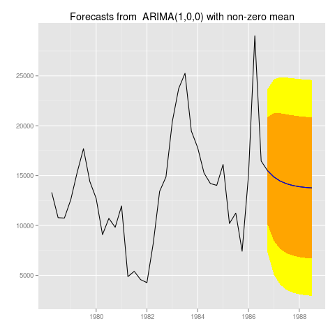
If we want to reproduce that behavior with ggplot on things of class forecast, we might do something like:
# Timeplotting a forecast object with prediction intervals
library(forecast)
library(ggplot2)

autoplot.forecast <- function(forecast, ...){
  # data wrangling
  time <- attr(forecast$x, "tsp")
  time <- seq(time[1], attr(forecast$mean, "tsp")[2],
  by=1/time[3])
  lenx <- length(forecast$x)
  lenmn <- length(forecast$mean)

  df <- data.frame(time=time,
    x=c(forecast$x, forecast$mean),
    forecast=c(rep(NA, lenx), forecast$mean),
    low1=c(rep(NA, lenx), forecast$lower[, 1]),
    upp1=c(rep(NA, lenx), forecast$upper[, 1]),
    low2=c(rep(NA, lenx), forecast$lower[, 2]),
    upp2=c(rep(NA, lenx), forecast$upper[, 2])
  )

  ggplot(df, aes(time, x)) +
    geom_ribbon(aes(ymin=low2, ymax=upp2), fill="yellow") +
    geom_ribbon(aes(ymin=low1, ymax=upp1), fill="orange") +
    geom_line() +
    geom_line(data=df[!is.na(df$forecast), ], aes(time, forecast),
    color="blue", na.rm=TRUE) +
    scale_x_continuous("") +
    scale_y_continuous("") +
    opts(title=paste("Forecasts from ", forecast$method))
}
An example application would be
library(Mcomp)

myforecast <- forecast(auto.arima(M1[[222]]$x))
autoplot(myforecast)

myforecast <- forecast(auto.arima(M1[[893]]$x))
autoplot(myforecast)
Saving these graphs works exactly like you would expect. You could just do
myforecast <- forecast(auto.arima(M1[[222]]$x))

png("222.png")
autoplot(myforecast)
dev.off()
To get:
 ]
]
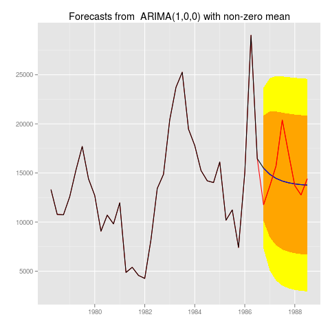
We can even extend this slightly so that the original series, forecast, prediction intervals, and the holdout (if present) are all plotted on the same graph:
autoplot.forecast <- function(forecast, ..., holdout=NaN){
  # data wrangling
  time <- attr(forecast$x, "tsp")
  time <- seq(time[1], attr(forecast$mean, "tsp")[2], by=1/time[3])
  lenx <- length(forecast$x)
  lenmn <- length(forecast$mean)

  df <- data.frame(time=time,
    x=c(forecast$x, forecast$mean),
    x2=c(forecast$x, rep(NA, lenmn-length(holdout)), holdout),
    forecast=c(rep(NA, lenx), forecast$mean),
    low1=c(rep(NA, lenx), forecast$lower[, 1]),
    upp1=c(rep(NA, lenx), forecast$upper[, 1]),
    low2=c(rep(NA, lenx), forecast$lower[, 2]),
    upp2=c(rep(NA, lenx), forecast$upper[, 2]),
    holdout=c(rep(NA, lenx+lenmn-length(holdout)), holdout)
  )

  ggplot(df, aes(time, x)) +
    geom_ribbon(aes(ymin=low2, ymax=upp2), fill="yellow") +
    geom_ribbon(aes(ymin=low1, ymax=upp1), fill="orange") +
    geom_line(data=df, aes(time, x2), color="red")+
    geom_line() +
    geom_line(data=df[!is.na(df$forecast), ], aes(time, forecast),
    color="blue", na.rm=TRUE) +
    geom_line(data=df[!is.na(df$holdout), ], aes(time, holdout),
    color="red", na.rm=TRUE) +
    scale_x_continuous("") +
    scale_y_continuous("") +
    opts(title=paste("Forecasts from ", forecast$method))
}
with example application
library(Mcomp)

x <- M1[[222]]
myforecast <- forecast(auto.arima(x$x))
autoplot(myforecast)
autoplot(myforecast, holdout=x$xx)
Which would produce graphs like:

Which personally, I like a lot, since it immediately shows you everything you want to know about the time series and your forecast.
Example: Autoplot and Linear Models
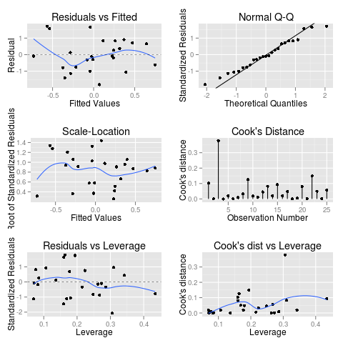
Say you don’t care about time series. Ok, fine. Well I’m guessing you care about linear regression. We can do this same kind of voodoo to things of class lm. Here’s something that roughly-kinda-sorta-almost emulates the behavior of plot(lm(y~x))
library(ggplot2)

autoplot.lm <- function(x, ..., which=c(1:3, 5), mfrow=c(1,1)){

  require(grid)
  df <- fortify(model)
  df <- cbind(df, rows=1:nrow(df))

  # residuals vs fitted
  g1 <- ggplot(df, aes(.fitted, .resid)) +
    geom_point() +
    geom_smooth(se=FALSE) +
    geom_hline(linetype=2, size=.2) +
    scale_x_continuous("Fitted Values") +
    scale_y_continuous("Residual") +
    opts(title="Residuals vs Fitted")

  # normal qq
  a <- quantile(df$.stdresid, c(0.25, 0.75))
  b <- qnorm(c(0.25, 0.75))
  slope <- diff(a)/diff(b)
  int <- a[1] - slope * b[1]
  g2 <- ggplot(df, aes(sample=.resid)) +
    stat_qq() +
    geom_abline(slope=slope, intercept=int) +
    scale_x_continuous("Theoretical Quantiles") +
    scale_y_continuous("Standardized Residuals") +
    opts(title="Normal Q-Q")

  # scale-location
  g3 <- ggplot(df, aes(.fitted, sqrt(abs(.stdresid)))) +
    geom_point() +
    geom_smooth(se=FALSE) +
    scale_x_continuous("Fitted Values") +
    scale_y_continuous("Root of Standardized Residuals") +
    opts(title="Scale-Location")

  # cook's distance
  g4 <- ggplot(df, aes(rows, .cooksd, ymin=0, ymax=.cooksd)) +
    geom_point() + geom_linerange() +
    scale_x_continuous("Observation Number") +
    scale_y_continuous("Cook's distance") +
    opts(title="Cook's Distance")

  # residuals vs leverage
  g5 <- ggplot(df, aes(.hat, .stdresid)) +
    geom_point() +
    geom_smooth(se=FALSE) +
    geom_hline(linetype=2, size=.2) +
    scale_x_continuous("Leverage") +
    scale_y_continuous("Standardized Residuals") +
    opts(title="Residuals vs Leverage")

  # cooksd vs leverage
  g6 <- ggplot(df, aes(.hat, .cooksd)) +
    geom_point() +
    geom_smooth(se=FALSE) +
    scale_x_continuous("Leverage") +
    scale_y_continuous("Cook's distance") +
    opts(title="Cook's dist vs Leverage")

  plots <- list(g1, g2, g3, g4, g5, g6)

  # making the plots
  grid.newpage()

  if (prod(mfrow)>1) {
    mypos <- expand.grid(1:mfrow[1], 1:mfrow[2])
    mypos <- mypos[with(mypos, order(Var1)), ]
    pushViewport(viewport(layout = grid.layout(mfrow[1], mfrow[2])))
    formatter <- function(.){}
  } else {
    mypos <- data.frame(matrix(1, length(which), 2))
    pushViewport(viewport(layout = grid.layout(1, 1)))
    formatter <- function(.) {
    .dontcare <- readline("Hit <Return> to see next plot: ")
    grid.newpage()
    }
  }

  j <- 1
  for (i in which){
    formatter()
    print(plots[[i]], vp=viewport(layout.pos.row=mypos[j,][1],
    layout.pos.col=mypos[j,][2]))
    j <- j+1
  }
}
Which even has that annoying “Hit

Here’s some example code to play with for autoplot.lm()
n <- 100
y <- rnorm(n)
x <- matrix(rnorm(n*4), ncol=4)
model <- lm(y~x)

autoplot(model)

autoplot(model, which=1:6, mfrow=c(3,2))
Well, that’s all for today. For those of you attending UseR Nashville, my hometown, I’ll see all y’all in trashville!